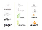

Ginger Restaurant Redesign
This rebrand was designed in my second year at OCAD and in my first branding class. The challenge was to rebrand a popular Toronto restaurant with a new logo. Ginger Vietnamese was an obvious choice for me because they use different logos for different locations around the city. I felt that their serif-font logo also did not represent their business very well. Their style of cuisine (while it may be somewhat fast food) incorporates a lot of bright and fresh flavours such as lime, cilantro, and ginger. I wanted to highlight this by incorporating a bright green colour. The bamboo imagery is also symbolic for family and growth in vietnamese culture. Since Ginger is a family owned business with a lot of aspiration for growth, I felt this would be a good choice.
OCAD, 2011
Tara S Portfolio 2016